Brother New Zealand Brand Identity.
We took an honest look at the role of printers in our lives. The truth is, they sit in the corner, unnoticed, until they’re called on. But when they’re called on, they need to do their job well, quickly, and without fuss.
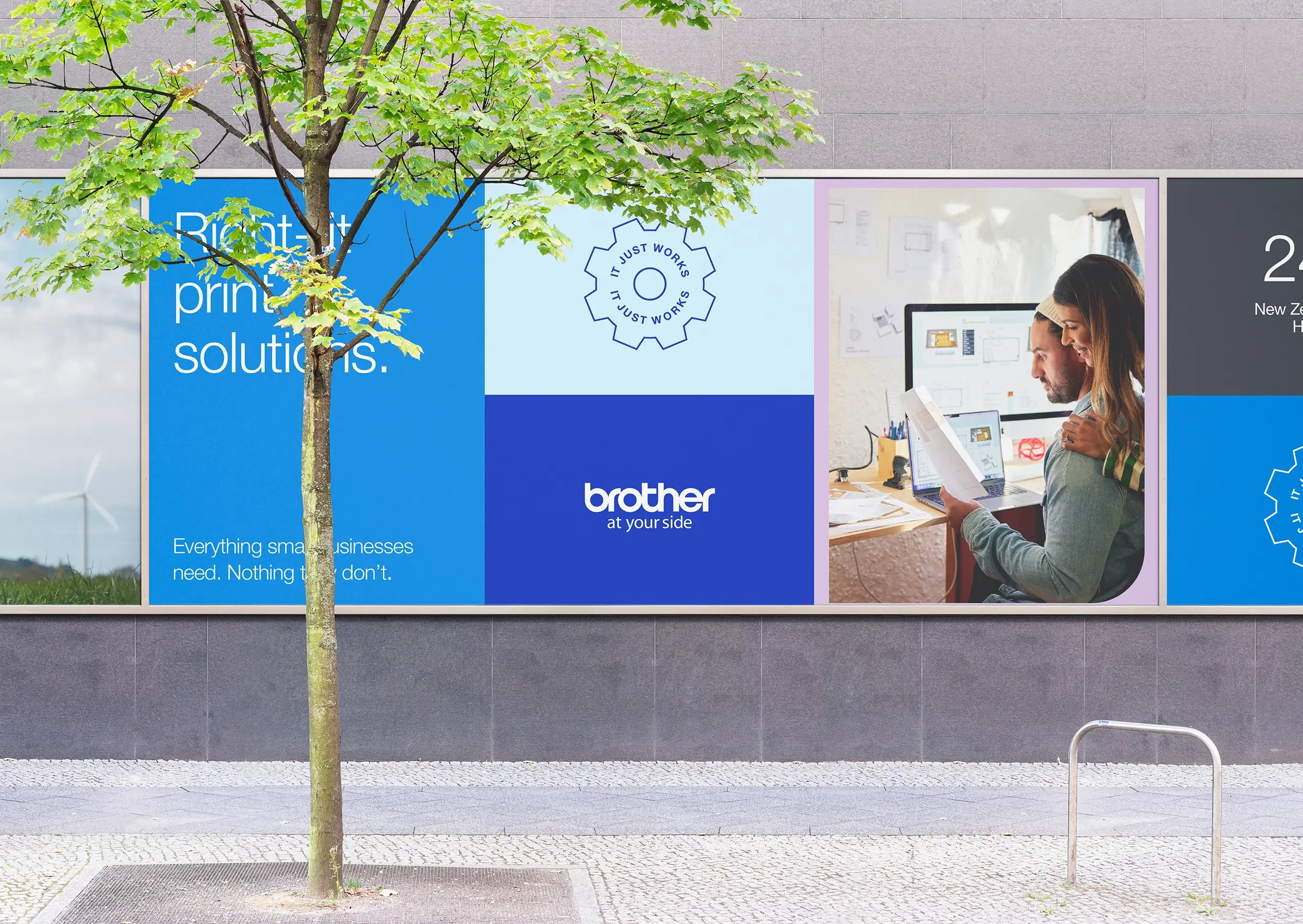
So many products fail to live up to our expectations, often letting us down and holding us back. Technology, most of all, is guilty of this. How many times has someone yelled, “Why won’t you just work!” at a printer? What a breath of fresh air, then, when things actually do.
With a rich Japanese heritage spanning over 100 years, Brother has focused on creating simple, high-quality products designed to last, allowing people to work without hassle.
This led to the new brand idea: "It Just Works."
Rejecting typical technology advertising with exaggerated promises, and focusing on what customers truly need: a reliable printer that works seamlessly.
This idea, rooted in Brother’s history sets them apart by emphasising reliability and simplicity, aligning with the practical needs and values of New Zealand customers.
The design elevates the message by highlighting the true innovator in the user-printer relationship: the person using it. This fosters a positive connection, allowing users to see themselves in the brand’s narrative.
Brother New Zealand’s revitalised brand identity captures the essence of the company’s mission and values. It presents a refreshingly honest, unified and flexible visual system that resonates with customers, supports brand growth, and elevates its market presence.